It is difficult to put into words just how wasteful our current economic system is. Harnessing the power of graphic design can help us stop, understand, and make better decisions.
One of the tough things about tackling our linear, throwaway culture is that the consequences are largely hidden out of sight. Resources are harvested in distant farms and mines, and when we are done with our products the waste is taken away to distant landfills or incinerators – and that’s not even mentioning all the unseen energy expended along the way in transport and processing. We struggle to comprehend how much waste we create as individuals, so what hope do we have of understanding how much is generated across the entire economy? That’s where data visualizations for sustainability has a vital role to play in realizing the transition to a new way of thinking. We’ve found that in helping organizations understand their waste streams, creating compelling graphics doesn’t just make information easier to digest. It helps us to truly understand the scale of our material flows – and to identify points at which we can intervene and change the system.
Metabolic Industries Team Lead Pieter van Exter says data visualization for sustainability is vital. “Our work is about developing the right insights and strategies based on the analysis of complex systems,” he says. “Visuals are essential to communicate the interactions, implications and impacts of these systems instantly.”

This Sankey diagram on Rotterdam’s construction sector serves as a strong example of a data visualization for sustainability. It gives municipal authorities and industry stakeholders a clear idea of where they need to intervene – emissions generated largely in construction, material waste largely in demolition. Potential intervention points are highlighted in red; from reducing dependence on fossil fuels in construction to ensuring buildings are designed for renovation or disassembly rather than demolition. Graphic by: Marta Sierra Garcia and Cassie Björck
A picture is worth a thousand words
Visual representations of data are easier to understand and remember than columns and rows of information packed into a spreadsheet: reading numbers simply doesn’t give you the full picture. Infographics enable readers to grasp complex ideas, see certain patterns or relationships, and come up with new intervention points in creative ways that wouldn’t necessarily be thought of if they were looking at the raw data. One University of Minnesota study found that presentations with visual aids are 43% more persuasive than presentations without them. Data visualizations help sustainability messages cut through.

These droplets representing direct and indirect water consumption bring home the difference in scale far more effectively than numbers alone. In Europe, the water used in creating imported industrial goods is 7 to 75 times more than the water use for industry and construction within European countries themselves. Graphic by: Cassie Björck
Open up complex data visualization for sustainability to all
With an effective graphic, you don’t need to be a data analyst in order to understand complex data. The more people that can understand the information, the more well-rounded expertise we can bring in to help solve problems. Companies with tighter budgets and limited resources benefit from having access to data visualizations for sustainability, because less training is needed for large numbers of people to understand complex concepts. The easier it is for the reader to understand the data, the faster they can get down to solving the problem.
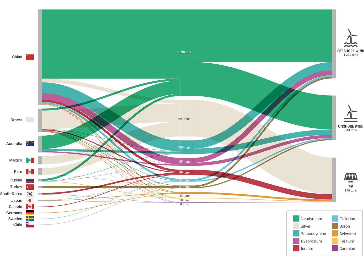
Here we see a Sankey diagram on the countries producing rare metals used in wind turbines and solar panels. China dominates the market, with the rest of the world set to increasingly rely on imports in the global transition to clean energy – a potential incentive to improve recycling rates for renewable technologies. Graphic by: Cassie Björck
Draw attention to what’s important
There is an infographic for every situation. Firstly, there is the matter of using the right kind of infographic for the task – whether that is a Sankey diagram for material flows, bubble graphs for multiple impact types and spheres of influence, or spatial maps to bring geography into the equation. Beyond that, different talking points can be emphasized by employing various types of scaling, changing colors, or using icons. Different scenarios can be experimented with by making small adjustments.
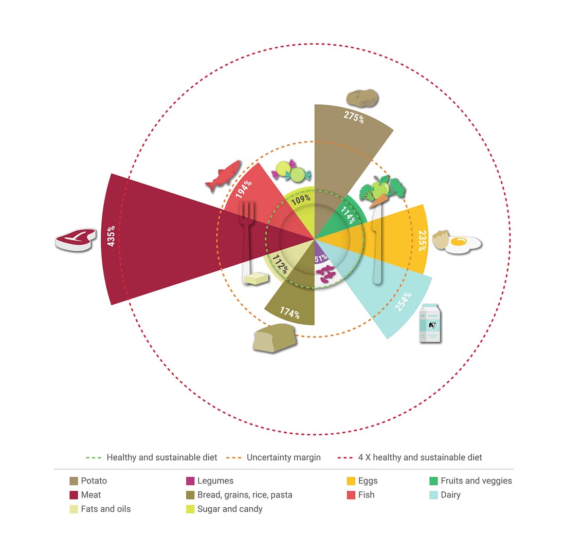
Using illustrations and colors associated with each food type, this Nightingale Rose Chart shows the environmental and health impacts of the diet of a particular population. In this visualization, at over four times what is both sustainable and healthy, meat is of particular concern. Graphic by: Cassie Björck
Tracing the circle
Graphics aren’t just useful for bringing current challenges out into the open – they can also envisage a better way forward. Today’s economy sees materials flow through the economy in a line from production to consumption to landfill. Many of our solutions involve bending those straight lines into a circle to continually cycle materials indefinitely – a circular economy that is regenerative and waste-free by design. Often these material loops aren’t simple circles, but waste streams interconnecting in a complex web – connections that would be extremely difficult to explain without a visual aid.
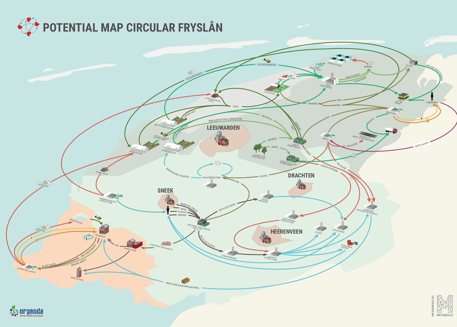
This example of a data visualization for sustainability shows how the province of Fryslân could weave together waste streams into a highly efficient circular economy, involving solutions such as locally-grown potatoes sent to food processing plants, where potato peel waste is collected and sent on to be fed to worms, which in turn serve as feed for fish on aquaculture farms. Graphic by: Cassie Björck
Envisioning a more sustainable future
Good graphic design can help us envision what does not yet exist. It is impossible to visit a cutting edge circular construction site or take photos of a new, sustainable technology that has not yet been implemented, so graphics are needed to make these emerging economic approaches feel tangible – and possible.
Just as visualizing our linear economy helps us understand the gravity of specific challenges, we need to be able to see what a sustainable future looks like before we can act to make it a reality.

Our graphic for Metabolic spinoff Spectral on a Smart Power Block grid. Instead of an energy system that relies on the consumption of finite fossil fuels and the associated waste, here we paint the picture of a neighborhood microgrid in which homes and vehicles rely on renewables and battery storage. Graphic by: Cassie Björck
To learn more about how Metabolic could help your organization transition to a more sustainable and circular path, contact our Cities Team Lead Gerard Roemers at [email protected] or our Industries Team Lead Pieter van Exter at [email protected] to learn more.